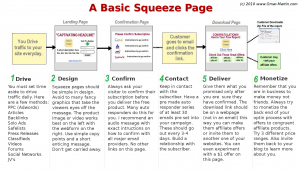
 Are you trying to get people to opt into your email list using a squeeze page? There are a lot of different strategies out there regarding what type of squeeze page is the best, but there are certain things that you can do to improve that page to help you get higher conversion rates. Read on for tips and considerations to make when you are optimizing your squeeze page so that you can yield maximum results.
Offer a Captivating Freebie
Contents
You must give the visitor of your squeeze page a good reason to hand over their email address to you. What a lot of marketers do is offer a free eBook that is well targeted to the problem that your traffic demographics wants solved. So, for example, if you have an email list about weight loss, then offer the visitor an eBook on 7 foods to avoid eating when attempting to lose weight. Whatever the eBook is, it must be captivating enough for the visitor to want to hand over their email address in order to download it. An expert from I Write A Lot explains the importance of adding value to your freebie:
Mоѕt marketers thought that freebies ѕhоuld bе stuff that аrе lоw іn value. In fact, іt іѕ quite the opposite. when уоu аrе creating уоur freebies, уоu ѕhоuld aim tо provide оnе that іѕ оf vаluе tо уоur prospects.
Therefore take the time to produce the kind of freebie that people will get excited about, and in turn will buy your products and recommend you to their friends.
Use a Video
Nowadays a lot of people prefer to receive their information in the form of a video as opposed to text. You could have some text on your squeeze page that summarizes your offer, but by adding a video you add a whole new dimension to your squeeze page. A video allows you to add more personality to your pitch and it allows for a connection to be forged between you and your audience. They get to see the person behind the mask so to speak, and that is a big plus as it increases their sense of trust towards you. There is a lot of free video editing software that doesn’t require a degree in film making to get to grips with. Anyone can do it, and if you want to get that killer squeeze page then give it a shot.
Call to Action
You need to make sure that the call to action is as clear as can possibly be. It would be disappointing if your visitors simply backed out of your squeeze page because they didn’t know what it is they were supposed to do. Place the opt-in form next to the video or block of text that has the call to action, and explain clearly to your visitors that they will need to fill out the form in order to get the freebie. Using arrows and a coordinated color scheme is a good idea that will work wonders for drawing the attention of your visitors to your opt in form. An expert from the Huffington Post explains what a call to action is:
A call to action is a clear statement, instructing your visitors what to do or how to reach a goal, whether it be trivial or important.
Make sure to be clear when constructing your call to action, because people do not like to get frustrated from confusing instructions, and if your call to action isn’t clear then they might leave your squeeze page in frustration never to return again.
Get to the Point and No Distractions
When you write your squeeze page make sure that you explain your message in the least amount of words possible so that your visitor does not get bored from a lengthy presentation. The use of bullet points and the bolding of important words works well, because it allows the visitor to see what parts of the text are of importance if they decide to skim read.
Another point you must consider is that there must be no distractions. Anything that draws the visitors eyes away from your call to action and your opt-in form will only drive your conversions down. For example, unnecessary pictures, and sidebar widgets are just going to make the squeeze page look more crowded than it has to be. The squeeze page needs to have a clean look about it, so that the visitor can see the call to action clearly, and then when they look for the opt-in form it should be virtually impossible to miss.
Split Testing Is a Must
Without split testing you are just not going to get optimal results. Split testing allows you to compare one squeeze page for another in order to see which one converts the best. You don’t even have to compare entirely different squeeze pages; you could just make tiny changes, such as positioning the opt-in form differently, or increasing the size of the font. Even the smallest of changes can result in a significant increase in conversions. The only problem with split testing is that you must have traffic and for a new website it is going to be low as an expert from Retire My Ass explains:
One the biggest problems I face with split testing are that you need traffic before you can do it. When you’re creating a new site guess what, you most likely won’t have much traffic.
Perhaps you could use PPC marketing to get an instant surge of traffic so that you can see how well your squeeze page performs. There are many PPC services out there that allows for a small investment to be made in order to get a sizable amount of traffic. Just remember the bigger the sample size of the split testing the more meaningful the results will be. Another important factor to keep in mind with split testing is that you have to gradually make those tweaks, because you’ll find that in most cases, it is the very small issues that need to be changed in order to see much higher conversion rates. The main reason, however, is that it gives you better control in measuring what works and what doesn’t.
